Nov 17, 2020
By Marie Oldfield CStat CSci
As an undergraduate student, or even before, those who study the ‘art’ of forecasting are warned of the uncertainty and perils associated with it. Forecasting is certainly an art and one to be taken with a pinch of salt at times. In the last blog, I discussed the context and how important it is to statistics and analysis. Context and interdisciplinary working are so much more important in forecasting due to the uncertainty. If I was modelling hospitalisations in defence with a complex year such as 2020, like in the following article, I would have context from medics, military leaders, epidemiologists, behaviourists, psychologists and sociologists, all because of the complex nature of the output.
From my professional experience as well as specific experience in modelling hospital capacity and deaths from illness and war for Senior Miltary and Senior Civil Service as well as my extensive experience in modelling scenario sets I would like to put my professional opinion to the following article in the Telegraph.
In the following graphs from an article in the Telegraph (https://www.telegraph.co.uk/global-health/science-and-disease/science-mathematical-modelling-forecasting-future-must-understand/) we are again asked to trust the output in front of us. Those with eagle eyes will have already have spotted similar issues from the last blog that causes us to seriously question output. Let’s go ahead and dig into the forecasting part of this from the eyes of the public.
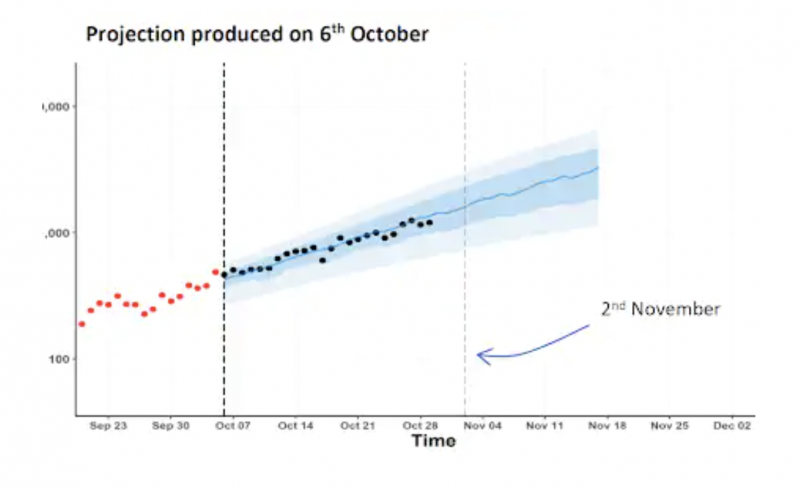
Below is the short term forecast. In the article, it does not state how many data points have been used to project the following 3 weeks in October. Apparently, only the red dots have been used. Given the amount of data we have in the UK and across the world this is not nearly enough to produce any meaningful output. The Blue area is not described. This, I would doubt is the error range. The error range for predictions such as this is extremely large, especially when a reasonable amount of data is used.
The article states that the blue represents a central projection, the line, and ranges for the projection – in this case two of them, a central 50 per cent prediction interval, and a wider, 90 per cent prediction interval. If we assume that the dark blue is 50% and the light blue is 90% and that these are ranges for the prediction then if we give a model 15 data points and ask it to predict something, it will, but the result will be of no use and will be a very small snapshot of a very small data group. This ignores the patterns and trends of larger data sets and the comparisons with previous years.
The blue area might make us think that the data are within a ‘reasonable’ range, however, this is a visual error. We have no adjustment for seasonality or trend and we are not told what model is used. It is important to know which type of forecasting model has been used and some would not be suitable for the data we might have and some can do complex things to the data and churn out graphs that are too complex to be simply presented in this way.
A very large and potentially problematic assumption has been made and the graph scales have been changed. The article states “This graph is plotted on a log scale: 100 to 1,000 to 10,000 instead of 200 to 400 to 600, which some people find easier to interpret, particularly when we are dealing with exponential growth – doubling, or indeed exponential decay – halving”. This is not strictly true. What should be presented here is the raw data, not a scale that shows what we want to show.
If we examine the graph we have a title describing a date of prediction, but we are not told what the prediction is supposed to predict. We also have a missing y axis lable and an x axis that labels weeks but has no granularity.
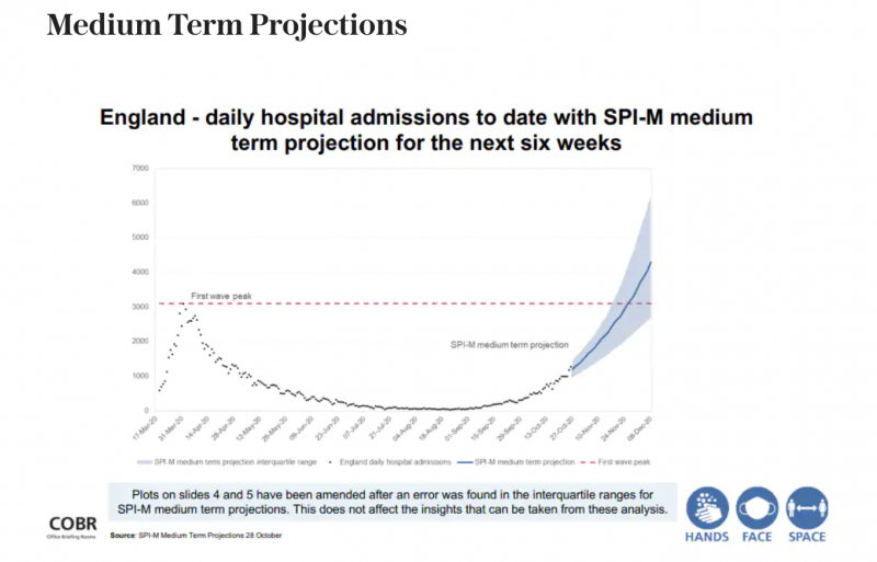
Below we have a graph for medium-term projections.
Here we have a graph of hospital admissions. We are not told what type of hospital admissions or why we would be interested in this graph. We start from near zero, indicating that in March less than 1000 people per day/week (assumed?) went into hospital – but we can’t tell if this is per day or per week or what scale it is on. Generally, when graphs that should follow real data start from zero, it is an indication of a change of scale. This changes the way the data are being represented and can be extremely misleading. There is an assumption on the graphs of a ‘first wave peak’. As we currently know a ‘first wave’ may be made up of non covid cases and general hospitalisations from seasonal flu or general health issues or from lack of healthcare availability. There is no clarification except to say general hospital admissions. We then see the red line passed across to the end of the year. A very problematic issue is that the graph states between June-Sept there were little to no hospitalisations. This does not reflect real data as generally there is a reasonable flow of hospitalisations. If there is a stem in flow we could potentially assume many people are ill or dying at home as they are not in the hospital. A simple comparison to hospital admission rates would illustrate this. The ONS states it carries this data but a notice on the relevant page now states that the ONS does not carry the data and redirects you to a website on the NHS that does not seem to have it either. After a long time searching for data it appears NHS digital has data on finished consultant episodes,
(https://digital.nhs.uk/data-and-information/publications/statistical/hospital-admitted-patient-care-activity/2018-19)
which doesn’t appear to me to be similar to normal admissions tables found in individual hospitals. However, if we look at readmission rates for the elderly at Portsmouth Hospitals trust, out of thousands admitted there is generally a 1000 re-admission rate per month to be expected
(https://www.porthosp.nhs.uk/aboutus/publications/Annual%20Report%20and%20Accounts%202018-2019.pdf).
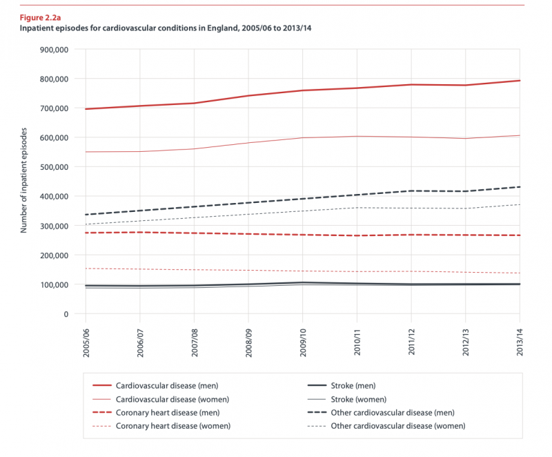
If we examine the ‘consultant finished episodes’ we see hundreds of thousands of counts and if we look at Heart Disease and Cancer Deaths in 2016 (bhf-cvd-statistics-2015-final.pdf) we see approx 800,000 admissions for all circulatory diseases between 2013-2014. This graph states the number of inpatient episodes and shows quite a large number of people. Therefore, as it is clear people are being admitted to, and staying in, hospital for many reasons, if the medium-term graph is correct for the summer months I would be extremely perturbed.
Another aspect we can examine is the projection. Again the blue area is not described or explained. The graphs state it is daily hospital admissions. If the graph is so low for summer as this is indeed accurate then I would expect a seriously large surge at some point unless people are dying at home. As we discussed in the last blog, we have to turn to real-life for any kind of explanation. One of the explanations for this is that during the lockdown healthcare was not accessible. This was not only for people with serious conditions and those needing to be examined but for those with simple infections that got much worse through lack of care. Also, as the SAGE project of coercion of the population through fear was underway people may not have felt comfortable leaving their house or seeking medical help. Therefore, I would not only expect a surge in hospital admissions but deaths linked to untreated issues and conditions such as late cancer diagnosis.
(https://assets.publishing.service.gov.uk/government/uploads/system/uploads/attachment_data/file/887467/25-options-for-increasing-adherence-to-social-distancing-measures-22032020.pdf)
There is also a problem with the data if only a few data points have been put into the model (which one we do not know) then the model would predict from this and go upwards. A statistical model would find it extremely difficult to predict anything from this data as there is no pattern. If we are looking for a trend we must have data from previous years to examine as we cannot build a trend from one specific data set or predict from it. I would therefore expect this prediction to fail. The longer-term nature of this prediction also garners such large error bars that it could not be relied upon or used. A typical prediction from this type of data would yield a few days or a week’s worth of predictions. The models we have are not able to predict with any degree of certainty over longer periods of time. If we examine the notes at the bottom of the graph we see that the graph has been amended, again this could be misleading. We also have no axis labels. It is extremely difficult to gain any useful information with this graph. It is also interesting to note that, despite hospital admissions being modeled, there is an unavailability of hospital admissions data generally and the comment from SAGE commissioned modelers was that they weren’t able to access NHS data either timely or at all.
(Lords Select Committee on Science and Technology Afternoon Session – Corrected oral evidence: The Science of COVID-19, London, 2 June 2020)
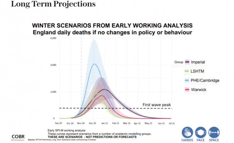
Finally, we turn to the longer term graph. This graph purports to be about winter scenarios. What type of scenarios we are not told. The fact that the graph states early working analysis indicates that the numbers are not robust, validated, or verified. Also, the models and data have not been provided so there is no way to understand how these numbers have been generated. The graph states no changes in ‘policy or behaviour’ but does not benchmark these against a starting point or describe what ‘policy and behaviour’ constitutes. Also, it is interesting that the SAGE Modelers also stated that had trouble modelling behaviour due to constant policy interference. (Lords Select Committee on Science and Technology Afternoon Session – Corrected oral evidence: The Science of COVID-19, London, 2 June 2020). The graph takes predictions from Warwick, PHE, SHTM, and Imperial. As we already know, the Imperial modelling was flawed from the non-reproducibility of the first wave predictions and the erroneous projections produced over the last decade for different cases of flu. We could readily discount this output, however, let us continue with it for comparison.
This graph represents scenarios, not forecasts or predictions, states the graph. When we discuss scenarios the typical way of constructing them in government is to use very best cases and very worst cases, So what would happen if we brexit and:
Case 1: The borders are flooded with people and the border forces can’t process them fast enough
Case 2: We have enough border agents and a constant, reasonable flow with high peaks at times that we struggle with
Case 3: We have lots of agents, we can easily deal with border traffic and even have extra capacity.
We can see that the three cases are extremely different in input and output. What we don’t know is what each of these lines represents. They could all represent the worst or the best cases. We also don’t know what parameters have been used. If one parameter is that cheese increases England Daily Deaths then we might want to discard that analysis. That is reallly all the data we have from this graph and not knowing what is on this graph we can’t really comment on it. There is a time on the X axis and an unlabelled Y axis. The coloured areas aren’t explained or labelled. If we assumed the coloured areas were confidence levels or error levels then this graph would be discarded due to being extremely misleading. The areas are simply too large and represent a huge area where the prediction could actually fall. Giving a measure of death between 2000 and 6000 is a very poor measure, not robust and gives whomever the recipient is no idea what to plan for. This really does show how all the errors in the previous forecasting graphs have been cumulated. Even if we were to assume – and this would be a mighty stretch and massively misleading, but if we assumed this was a graph of deaths in England in winter 2020, then these figures are not large at all. If we note that start from zero we can see that the axis and presentation has been altered to show a particular picture. Across the years, winter deaths sit at around 40,000 per month.
(https://www.ons.gov.uk/peoplepopulationandcommunity/birthsdeathsandmarriages/deaths/adhocs/10911monthlydeathsenglandandwalesdeathsthatoccurredbetween2001and2018)
Excess deaths in winter have been known to reach 50,000. Therefore it is difficult to see what this graph provides us with.
As we can see, a lot of the graphs currently being put out by the media and various sources are relying on you to interpret them and draw a conclusion. We all interpret things differently and we all come to different conclusions. It’s also very easy, with all the talk of covid, to interpret these graphs in a particular way.
As a statistician and scientist, I would not use these graphs or put any stock in them. I would not present this output to stakeholders as it is unethical, misleading and lacks basic process. The analysis is not robust and missing many basic features and explanations. As a professional, I would provide very simple graphs of raw data explaining what has happened, and in comparison with the last few years data, known characteristics and parameters of the virus and other known roadblocks such a seasonal flu, I would be presenting deaths in context. I have modelled hospital capacity and deaths from illness and war for Senior Miltary and Senior Civil Service, I have also modelled many many scenario sets. It is also therefore important for me to mention that the Government requires models to be verified and validated before the output is used for policymaking. Many of the models used during the last year are not only not verified and validated but have not even been checked in an interdisciplinary fashion for accuracy. It is worth reading the Lords Enquiry into this for further information.
A couple more contextual points for those wishing to really check the background of a source.
- When one submits a journal article they have to make the data and code available. It is key to note that not only has this not been made available in some cases, where code has been provided there have been there are little to no people that can reproduce the answers from the model.
- It did take a legal challenge to get the initial covid modelling output from SAGE, which came in a similar fashion to the graphs in this blog, with little to no explanation and in poor form.
- When a journal article is reviewed it has to have references to show a review of current work. Not only did the SAGE output initially have no sources (added later) the DFT paper sent out as a Freedom of Information request quoted sources that not only did not support it’s position, they stated that facemasks can be very harmful. Authors, when seeing that their papers had been quoted in this way, added notes to their published work about it.
It is crucial to be vigilant about what we are being told as our basic techniques for interpretation of graphs can help us interrogate whether the output is even useful or not. Advanced techniques to dig into the background of the data can also show us if the analysis sits on firm ground or not. Context is always the key.


