Nov 06, 2020
By Marie Oldfield CStat CSci
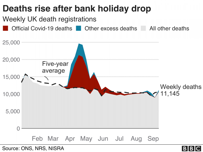
Graphs…the perpetual conundrum. If you haven’t got the source data it is hard to understand what is being shown sometimes. This week I was shown a graph and asked, what is wrong with this. The graph is below:
This graph initially looks to be made up of 3 data sources, ONS, NRS, NISRA that have amalgamated. Normally putting multiple data sources and multiple measurements on a graph is not wise as it is very difficult to determine what is actually being represented, and to represent it clearly. We also don’t know the way the data has been modified or cleansed by each party.
The graph states a weekly trend but the axis is in months. Therefore we are missing granularity.
The graph title discusses an uptick in deaths after the bank holiday. The specific bank holiday referred to is missing but if we assume it is the one in August then we see an unexpected drop in deaths and then a rise in ‘other’ deaths. The grey area is not explained so we are unsure if the colours areas are in addition to or part of the grey area. if we are concentrating on the specific bank holiday rise then we could use the graph to show this in better detail rather than as a comparison to previous months.
We can see that, despite having a trend, we are missing the months of October, November, December, and January. Examining death rates these months would be significant because the last few years of data from the ONS shows a large peak. Also if we examine 2018 there was a very large unexplained peak of deaths during these months. Due to this jump in 2018, we might see a skewed trend line. In Feb/Mar we see a trend line higher than the actual deaths and this might be due to the skew problems.
The graph shows a darker forefront colour for covid deaths, semi obscuring the lighter coloured ‘other’ deaths. We don’t know what the ‘other’ deaths constitute but they are high.
The article this graph comes from does mention that ‘covid’ deaths were calculated from death certificates mentioning covid. This might mean that ‘covid’ was not a primary cause of death. Death is normally recorded by primary cause not be a mention of an illness so it would be debatable if the data was correct. We would then have to ask, is the primary cause of death recorded, and if so, does this mean the death was counted as a primary cause and as a ‘covid’ mention. If the death was converted to a ‘covid’ mention then do we have a record of primary causes of death or are we causing problems in statistics of causes of death. This might mean that cancer or heart disease deaths might be lower as the death record might have been converted in this way.
The article this graph sits in gives very little information or context.
The first few points and the article itself would be enough for me to discard this graph. My initial action would be to check out the background data, but for those who don’t have a lot of time to do this, and let’s face it we don’t all have that luxury, these are a few pointers we can use to decide if a chart or graph is telling us anything reasonable.
It’s worth considering that statistics just doesn’t sit alone in the world, it always sits in a context. Therefore, we have to make sure we represent the real world as accurately and objectively as we can and ensure the context is put across with the data, otherwise the data can be misleading or uninterpretable.
