Nov 27, 2020
By Marie Oldfield CSci CStat and Murray McMonies RN
This week a discussion sprung up about a new risk model for COVID and how much it should relied on. Link to the publication here: https://www.nature.com/articles/s41562-020-01000-9
The article purports to :
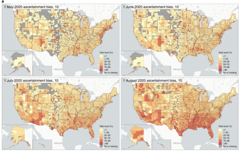
Large events and gatherings, particularly those taking place indoors, have been linked to multi transmission events that have accelerated the pandemic spread of severe acute respiratory syndrome coronavirus 2 (SARS-CoV-2). To provide real-time, geolocalized risk information, we developed an interactive online dashboard that estimates the risk that at least one individual with SARS-CoV-2 is present in gatherings of different sizes in the United States. An example of the output is below.
I had several issues with the robustness of the model
- Based on the fully discredited Ferguson Modelling
- Uses red which is a recognised colour representing risk
- Uses scenario analysis – which we saw in the last blog can be problematic when inserted into a model without explanation.
- Gives you a risk factor of catching Covid at a gathering in an area
- Relies on sparse information to make these predictions
- Does not list the assumptions
- Discards the fact that ‘cases’ are not necessarily leading to deaths and so overemphasises the risks
- Seems to assume people who catch it die when in fact the healthy young and middle-aged have an extremely low risk of this.
- Predicts the same for global covid but yet doesn’t have global geographic data
Again these are enough issues to prompt discussion and robust investigation. This complex-looking heatmap system can be shown to be problematic not just in statistics but in terms of risk perception.
Risk evaluation by the lay person is seldom based on objective evidence. In the objective and scientific sense it is correct to evaluate any risk based on balanced case considering likelihood, consequence, reward and competing risks. However, the public perception of a risk will be commonly based upon more subjective factors, which are often misunderstood and based upon simple heuristics. These include their perception of their voluntariness, controllability, familiarity, understanding, uncertainty, trust in institutions, personal stake and the perceived origin, catastrophic potential, equity, and benefits associated with that risk. So, the nature of the public attitude towards risks are often complex and in fact information pertaining to likelihood is often ineffective in changing their view point to a given risk.
In the study discussed this has attempted to identify and present likelihood. However, what needs to be considered is the perception of the consequence, here the consequence being contracting COVID-19. What does this mean to the lay person receiving this information? If the person receiving this information has very little to no concern of contracting COVID, or similarly, if the thought of contracting COVID has significant dread associated with it, then their ability to evaluate risk in terms of likelihood has little to no benefit.
Whenever we display and present data in graphical or pictorial form, we should always take extreme caution in how we frame that data. It is unfair to the reader to present in a way that is influencing their interpretation. Here in this paper, the use of colours of shading, relating to likelihood of spread, could have potential impact on the receiving person. It is common across many cultures that the colour red is associated with ‘danger’. Here we see colours graduating towards red. This may be considered to have an influence on the interpretation and conclusion the data. Particularly when we consider that public perception of risk is often more associated with the perception of the consequence rather than the likelihood.
The seminar on this can be found on youtube at the following link
